


Tropical Modern – Hyde Park

This architecturally bold and decisive Johannesburg home has another side to it — subtle and filled with clever contrasts.
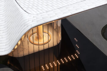
Located in the Johannesburg suburb of Hyde Park, this house, which is part of a cluster of three, begins with a mystery. From the driveway it appears like an almost featureless, off-shutter concrete monolith. It has a gigantic, 3.8-metre-high mechanical-looking steel door set into the facade with a wheel, a crank handle and a bolt that slots into a groove in the ground. It might even look fort-like in its apparent unwillingness to betray anything about what happens behind that impenetrable-looking door. Even the garage is disguised: rather than three doors, there’s simply a sleek, mute wooden surface on an extension of the L-shaped courtyard.
But there’s another dimension to it: a softness that comes into focus the longer you look. The driveway surface is criss-crossed with a grid of narrow strips of grass. The top of the concrete facade is bordered with a row of plants that dissipates into the sky, so the monochrome is softened with a splash of green. Principal architect Enrico Daffonchio of Daffonchio and Associates Architects points out that rather than being forbidding, this approach creates a sense of anticipation. “What’s happening up there?” he asks. (A Le Corbusier roof garden with a Jacuzzi and yoga deck, if you must know.)
When you pass over the threshold, you enter a triple-volume, seven-metre-high hall. “It’s a very powerful space,” says Daffonchio. There’s a balancing act between opulence and almost over-the-top extravagance on the one hand, and raw, bare minimalism and simplicity on the other. The space’s interior wall is raw off-shutter concrete, as it is outside, but the walls on either side have soaring staircases with glass balustrades that seem to lift off into the air. They’re sleek and refined, glinting in contrast to the rawness. At strategic points, wooden ceilings and walls and the undersides of staircases add warmth.


The whole house is an essay in contrasts, a layering of raw and refined to create an exhilarating tension between the two. “It’s a very thin line between being bold and exciting and over-the-top,” says Enrico. The sense of opulence belies the home’s economical use of space. You soon realize that the space you’ve entered is the house. “Basically the concept of this house is that it’s one room,” explains Daffonchio. “There’s no separate patio, there’s no separate kitchen. You don’t have different rooms. You can change it a little bit by opening and closing the doors, but it’s essentially one space. It’s like a really amazing, super-generous, super-luxurious room.”
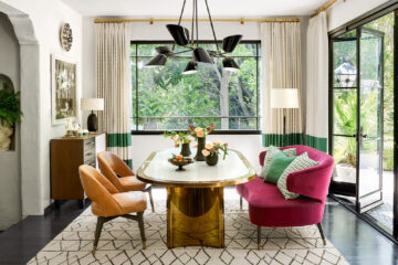
The central, dramatic volume is bookended on one side by the kitchen area and on the other by a reading nook in a beautiful well of light. To the front of the house, the lounge and dining areas are defined by a lower, stained white oak ceiling.
The wall behind the kitchen island is clad in walnut. “The timber is really great to give the space warmth and define it,” says project architect Frances Joynt. A little like the garage doors, while the panelling might appear seamless, it actually disguises cupboard doors and storage. Similarly, the fine Neolith used for the kitchen island can be used for surface and sides, so the island appears like a smooth, sculptural block rather than a jumble of drawers, although it, too, contains storage. To the side of the kitchen, a reflective black glass sliding door can be moved over into a cavity in the wall to unite the kitchen area with a back-of-house kitchen and scullery. When not needed, it presents another seamless surface contrasting with the raw concrete, but it is cleverly softened with the reflections of the garden it catches.
“You really have a very intentional, a very decisive use of materials,” says Daffonchio. While the raw concrete is layered with contrasting materials like wood and glass, or in the case of the guest bathroom, brass, the layering is restrained and carefully modulated. “You have to be careful about having too many elements or too many materials. To play with more than three or four materials, you really risk making a mess,” he adds. The pared-down forms, like the kitchen island, carefully avoid visual busyness.
The lower (but still not too low) oiled white oak ceiling in the lounge and dining areas creates a sense of intimacy softened with the use of timber. When you make such bold, decisive architectural choices, you have to fill the rooms with decisive, bold interior design and furnishings.
The lounge and dining areas in turn look over the pool and garden. They have a 3.8-metre-high floor-to-ceiling sliding glass door that can disappear into a cavity in the wall. “The doors actually slide around the corners so you can open this whole space and it flows out onto the patio,” says Joynt. It’s one of those seemingly simple things that is actually very complex (because of that corner). The huge ceramic tiles that run throughout the ground floor travel seamlessly outside and right up to the pool deck, helping to blur the distinction between outside and in, joining rather than separating spaces. Even the beach entrance to the pool is a gradual transition contrasting with other hard edges. In another clever inversion, the soft material of the landscaping is precise and geometric — a straight-lined pattern of differing heights and textures of grass picking up on the lines of the architecture.
Seen from the garden, the house appears to be the polar opposite of its massive concrete south facade. It’s transparent and light, and almost invisible. “You have the first floor floating on an almost hollow ground floor,” says Daffonchio. “When you look from the front, the bedrooms are aloft, and the ground floor is very open.”
The unchanging nature of the entrance is also contrasted here with sliding screens for the bedrooms upstairs. This is partly an effect of the home’s passive solar design for energy efficiency. “It’s layered: shutters, balustrade, glass, curtains,” Daffonchio points out. “You’ve got four layers you can use to modulate the light.” But it also has the effect of constantly changing the facade with the time of day, seasons and its inhabitants’ needs.
The contrasts and tensions are everywhere, bringing a conceptual richness to the house. In turn, the effect is calming and energizing. The effect is coherent, a kind of contained grandeur that retains its intimacy. It’s focused without ever being dull.
Photos by Greg Cox


No Comment